

300% growth in ratings and review through pure design
How we redesigned ratings & reviews at BookMyShow, making it faster, easier, delightful and more trustworthy for 50M+ MAU
BookMyShow is India's leading entertainment ticketing platform. With over 10 million tickets booked each month, we had one of the largest audiences for moviegoers in the country.
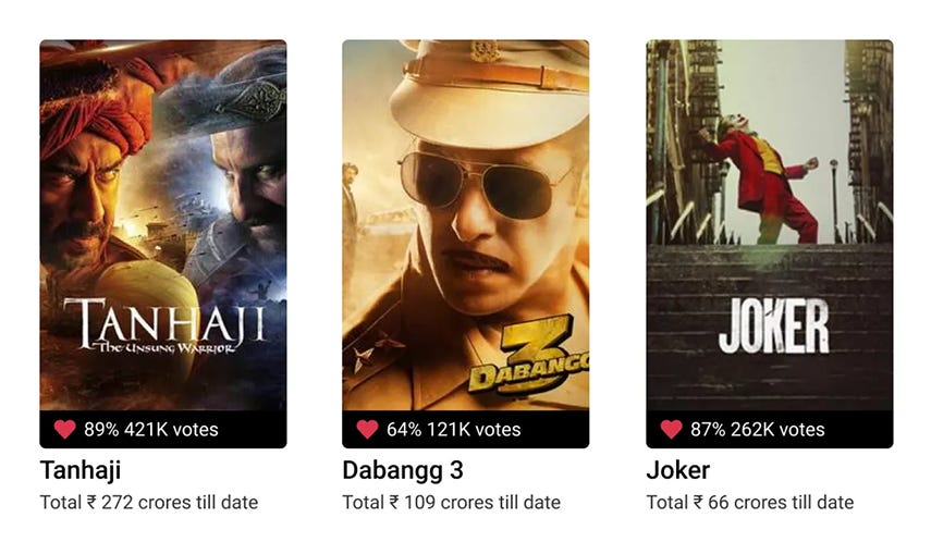
But we noticed a silent gap. Despite the volume of bookings, very few users were rating or reviewing films. This matters a lot in India, as a film’s first weekend (when it releases on Friday) can make or break its success. Good reviews influence audiences immediately, and BookMyShow’s brand already had more weight in India than even IMDb or Rotten Tomatoes when it came to local movie sentiment. (Unofficially, OTTs like Netflix and Amazon Prime decide rates to buy rights for the film using BookMyShow’s rating.)
Yet, the review experience was clunky, trust was questionable, and hardly anyone took the effort to write. We decided to fix that with a lot of design intervention. The core sentiment was…
How might we empower users to choose the right movie and contribute meaningful reviews once they’ve watched it?
Our goal
Increase the number of movie reviews submitted by 25%
Reduce the average time-to-submit a review from 60 seconds to under 10 seconds within 3 months of launch
Maintain a minimum 80% user satisfaction score in usability testing
First the audit
I always encourage my team to begin with an audit of what already exists. In legacy products, there is the collective wisdom of earlier teams. Auditing not only helps surface what worked (and what didn’t), but also gives the current team a chance to clean up Figma files, reduce design debt, and revisit past decisions and data with a fresh lens.
We found:
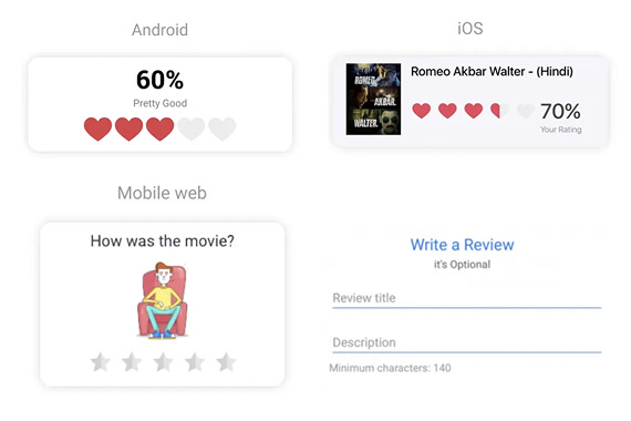
10+ inconsistent rating icons (stars, hearts, percentages)
Reviews are buried in low-visibility areas
No clear feedback loop — users weren’t acknowledged or incentivized
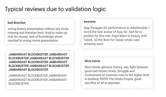
People writing 140-character gibberish just to bypass the validation
Solution: We cleaned it up. Picked one visual language (heart ratings), reduced friction, and built a system. Yes, showing ‘Star’ for ratings has zero cognitive load. But being the only dominant player in the Indian landscape, we made peace with the brand and marketing ambitions of being bold and setting new standards.
Listening to 1400+ users
Before jumping into solutions, we spent time understanding why people weren’t writing reviews.
We ran two rounds of research — first with 62 users through deep phone calls and surveys, followed by a broader survey with 1400+ users. What we uncovered were problems that seem small from the outside, but completely block action when you're the one using the product.
We wanted answers to three core questions:
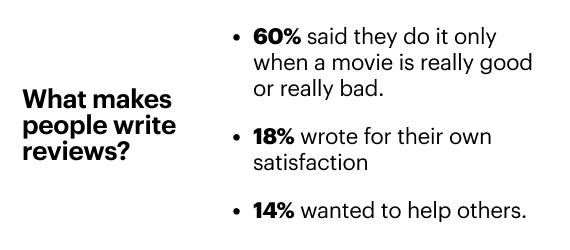
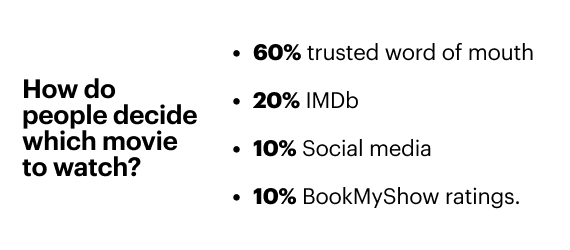
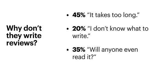
These weren’t usability bugs. These were evident emotional blockers: Hesitation, effort, doubt, and a feeling of being judged by others.
Obvious fixes
We studied the end-to-end rating and review flows of various other apps like Tripadvisor, IMDb, and Amazon, and looked for commonalities and patterns that users are habituated to
Reduce the friction.
Create multiple entry points,
Add lightweight review forms, push notifications,
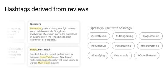
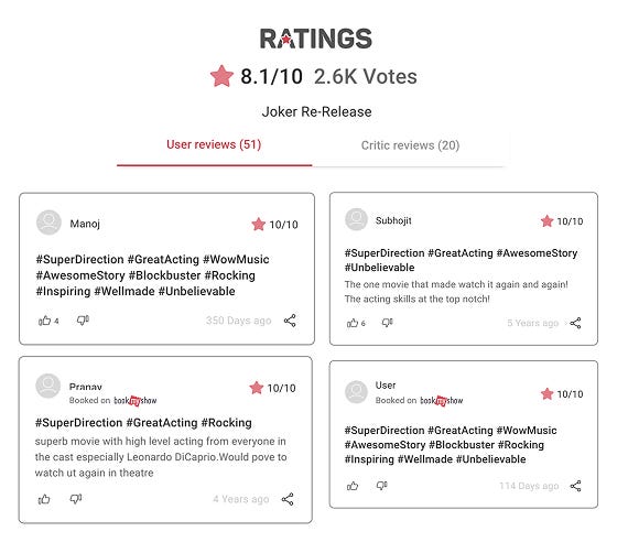
Pre-fill hashtags based on real user language like “Jhakaas”, “One-time watch”, and “Blockbuster”. Just enough to get someone started.
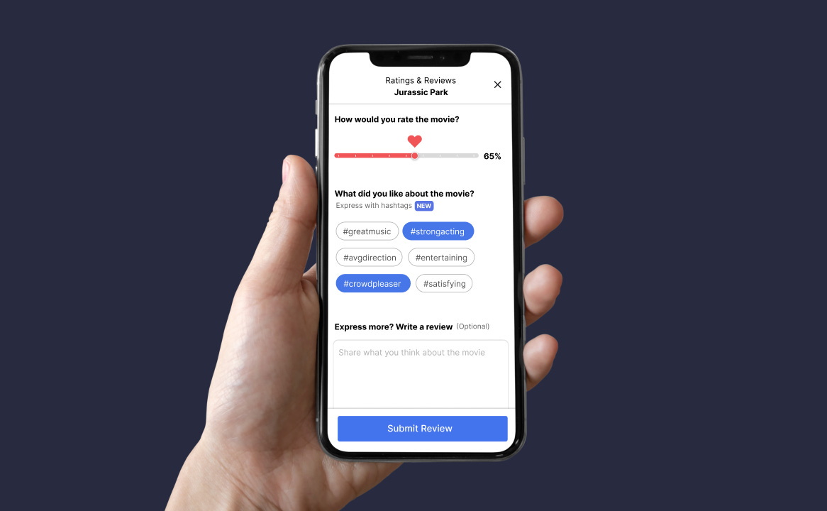
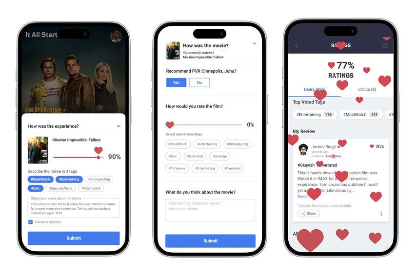
Designed a 3-step (10 secs) review flow
We tested 30+ prototypes and landed on a clean, modular component:
Drag-and-release heart slider (with snap + haptic feedback)
Select optional hashtags
Write a review (optional)
The entire flow took just 9–10 seconds for most users.
Made reviews trustworthy
Trust is a critical component. Only users who booked tickets on BookMyShow showed up with a “Verified” badge. We also changed the backend rating algorithm to give more weight to these verified inputs — reducing fake or spammy reviews.
Build once. Reuse across platforms and partners.
The review component is a modular system that could be reused in a wide range of use cases. Homepage nudges for returning users. Movie details pages to show the split of ratings and reviews for one who is deciding to watch. Post-movie notifications encourage a verified user to rate and review.
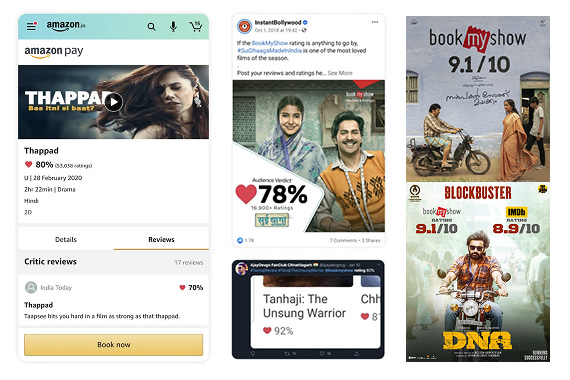
This even enabled new partnerships with Amazon India, where our ratings were syndicated for movie listings.
Impact is worth talking about
Time to submit a review dropped from 60s to 10s
24% increase in reviews within the first month
3x growth in meaningful written reviews over time
Boosted credibility and social shares across platforms
Today, BookMyShow has the highest number of ratings and reviews for Indian movies in the world — even surpassing IMDb and Rotten Tomatoes for some films like Bahubali.
Reflections from this project
This was one of the most fulfilling product interventions I’ve led at BookMyShow, undertaking a business-critical yet underloved feature and turning it into something simple, trusted, and widely used. And we did it not through big bets, but through small, thoughtful design decisions backed by listening and empathy.
Along the way, I picked up a few timeless takeaways — especially for designers who want to drive meaningful change:
Add affordances. People don’t type. Make it easier to start. Nudges, hashtags, sliderseven small cues help break inertia.
Don’t make me think. People don’t read. TL;DR summaries, icons, and scannable content go a long way. Especially as we move into the Reels world.
Give care, expect care. People don’t always care, and that’s okay. if we as designers do our job with love, care, and attention, so will our users care enough to take the next step.
Design won’t work in isolation. Work with your PMs, devs, QA, and marketing. Collaboration builds momentum and earns trust.
Build a culture of empathy. Design is not about control. It’s about creating systems that work even when you're not in the room.
Good design isn’t just about pixels or polish. It’s about nudging human behavior, at scale, with care.
On that note, I would like to thank Jasdev for championing this project from the Design team. Please comment and let me know what do you think.