Cleartrip gets a makeover on Mobile Web
A couple of years ago, we undertook a complete redesign of our desktop website, codenamed Tuxedo. The Tuxedo project served to make our desktop site faster, simpler and better, but it paid no attention to our mobile site. Over time, as we lavished our attention on our desktop site and mobile apps, our mobile site began to feel aged and long in the tooth.
Today, we’re happy to announce that all products on our mobile site are now wearing Tuxedoes.
Three principles guided the mobile web redesign for us:
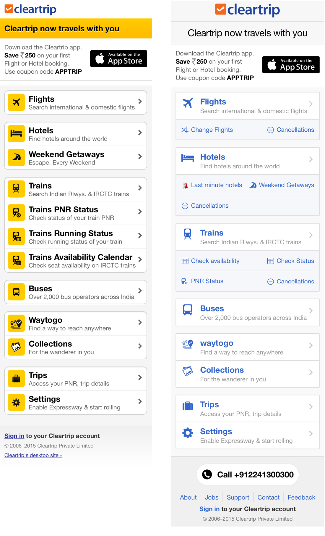
Move from the dated yellow colour palette to the white and blue theme of Tuxedo.
Ensure consistency of experience across desktop and mobile web.
Steal the best concepts from our app designs, without trying to mimic the apps on mobile web.
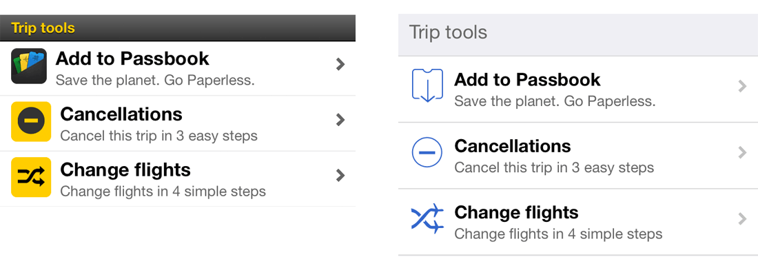
To begin with, the Cleartrip home page — all icons are now blue along with their respective trip tools for better discoverability. The footer has also been made consistent with the rest of our site.
The main menu is changed to the hamburger menu pattern, given the requirement of quick access to all the products we have available on mobile web.
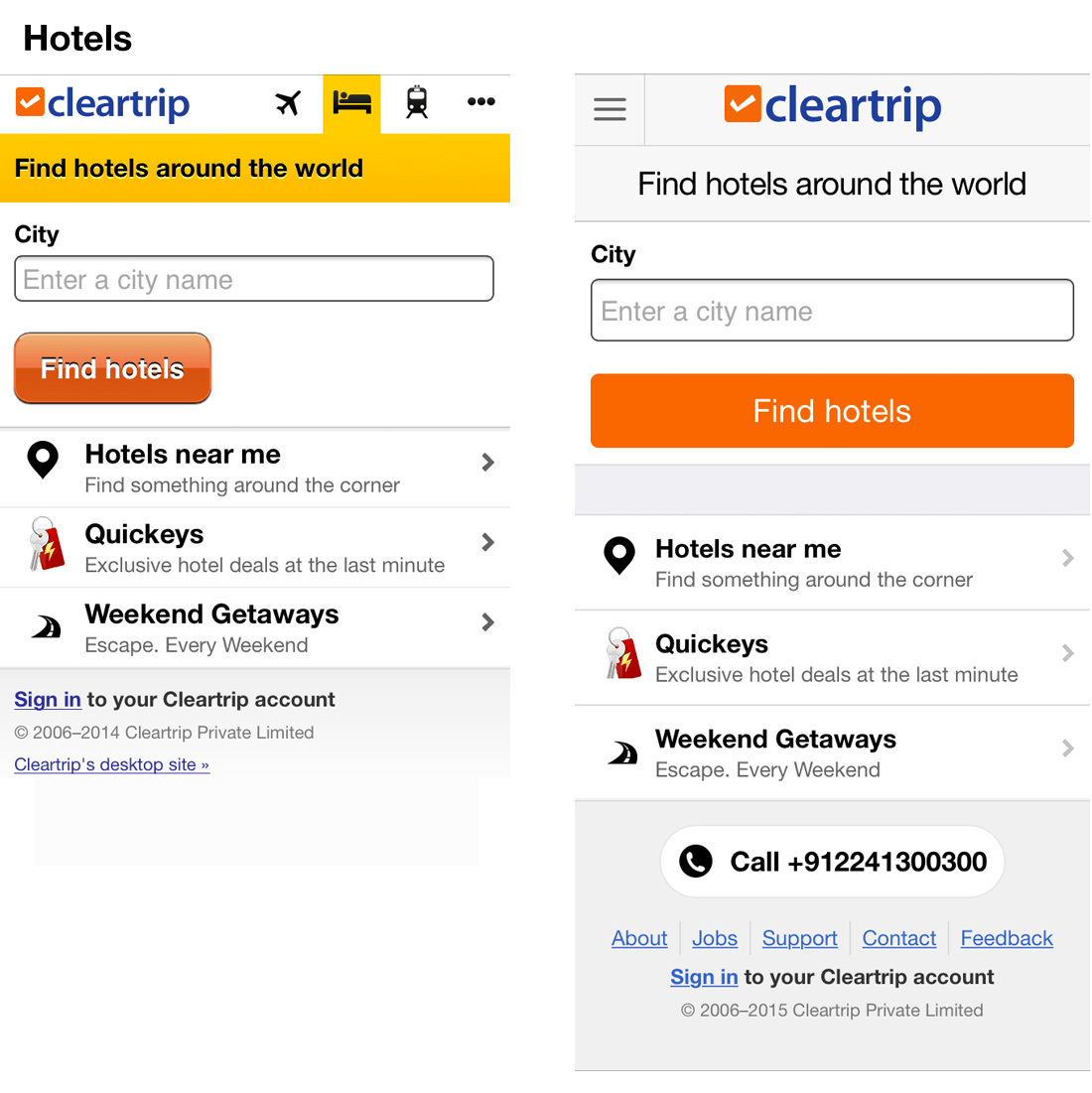
Flight, hotel and train search home pages have all undergone mere cosmetic changes.
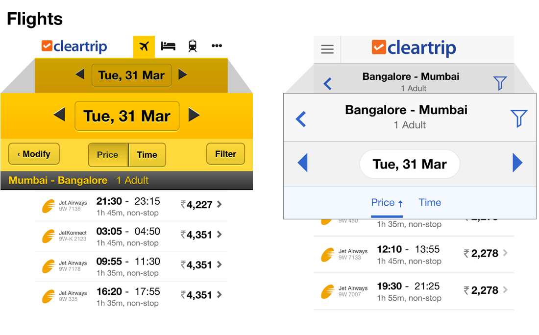
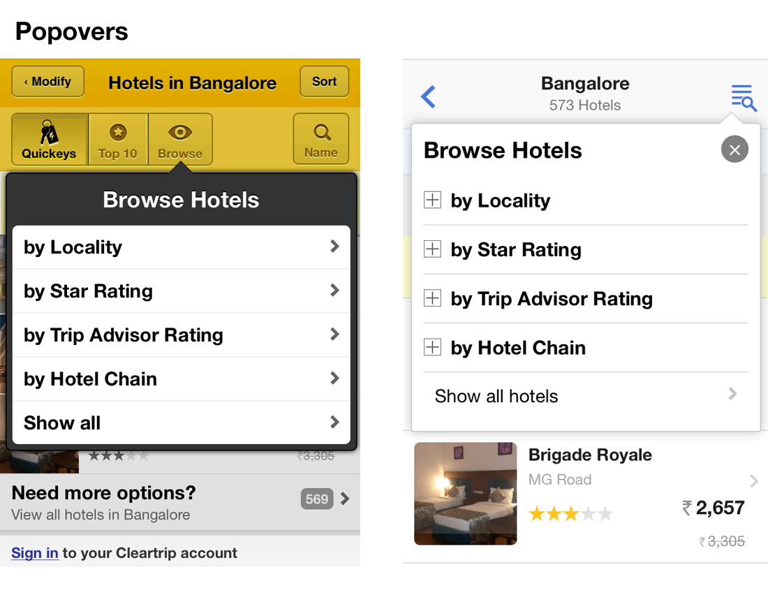
Search results, however, have seen significant changes for improved usability — changes in hierarchy, better utilisation of precious screen real-estate and a more natural way to filter and sort results.
We further brought all the itineraries to a consistent look and feel. For flights, we got rid of the heavy gradients to make the appearance more lightweight, while hotel details saw a major shift in how information is displayed and actions are taken.
There’s lots more subtle changes we made to achieve consistency with our desktop products.
There is a trend of brands shutting down their mobile sites in favor of mobile apps — they claim it is due to the overwhelming effort required to maintain all products across multiple platforms. We think that’s a terribly weak argument coming from companies that have no dearth of resources at their disposal. We’re committed to keeping Cleartrip accessible so our customers can use the channels they prefer. The web is one of the fastest and easiest platforms to develop and maintain (as compared to other front end platforms), and testimony to that, this entire project took us just 2 months to complete.
We’re excited to share this huge upgrade to Cleartrip’s mobile web experience and hope you enjoy the changes.
Originally published at blog.cleartrip.com on April 27, 2015.


