[Design Nuances] What makes the new book flow pleasing
Around two weeks ago we introduced a redesigned booking experience; a sexier, smarter, simpler travel booking process along with a cleaner, leaner, more useful travel confirmation page. We had a great time redesigning our booking process; and tending to all the little details was the funnest part of the process. Today, we’d like to walk you through some of these maddening details and how we approached them.
Indicators for steps in the booking process
All bookings on Cleartrip take place through a guided 3 or 4 step process depending on whether a user is signed in or not. Each step is now marked with neatly defined numbers whose display state is sensitive to context, such as whether that step has been completed or not. As you complete each step in the process, a comforting little tick appears next to the step number as an indicator that you’ve completed that part of the process. If you hover your mouse pointer over the completed step, the green tick changes into a black edit button to let you make changes. If you edit a step after completing it, the step number glows with a throb until you’re all done with your changes.
As you move from one step to the next, a gentle animation signals the transition. We used both jQuery and CSS3 to implement these animated transitions. Less capable browsers (IE) will not see the animation, but the experience degrades gracefully for them.
Compact itinerary format
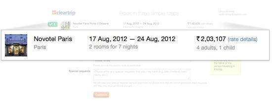
With the new design, we introduced a new compact view for the itinerary. We think this is a great little touch because it persistently makes information available to you after you move past the itinerary review step in the booking process — a quick glance is all it takes to reconfirm that you’re booking the right thing. Similarly, we also display a compact list of the traveller names you enter, making it easy to double-check that you’ve put in the right names and spellings.
The compact itinerary is also used on our booking confirmation pages and the confirmation e-mail.
Buttons made more usable, more useful
We’ve taken the new button design we created last year to the next level. The buttons now feel much more alive and responsive. The new ‘working’ state for a button has a slick candy-bar animation to indicate that something is happening in the background. Also, once a button is clicked it immediately enters its ‘working’ mode and gets disabled to prevent users from clicking a button twice and resubmitting data. For actions that take longer for the servers to respond, we’ve added text alongside the button so that you aren’t left wondering whether anything is happening or not.
A better way to redeem coupons
The old design of our coupon widget was a bugbear — it caused endless frustration for customers who couldn’t quite figure out how it worked or whether a coupon had been entered successfully or not. We paid special attention to it in this redesign, focusing on making it easier to use, easier to understand and easier to see the impact of entering a coupon code. The coupon widget got a makeover not just in terms of its look but also how it communicates with you. The new design eliminates any confusion by clearly stating how much you’ve saved as soon as a coupon code has been successfully entered. We also moved the widget into the first step of the booking process so you can enter your coupon and check that your discount has been applied before proceeding.
Humane errors
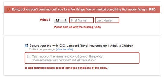
In the old design, form errors were displayed at the page-level and referenced the fields with a red mark. The new design displays errors at the field level with distinct red borders that make it unmissable. We’ve also spent a lot of time on the error messaging to make it easier for users to recover from errors and continue with what they came here to do.
Travel booking systems are inherently complex because they almost always involve the integration of multiple disparate third-party systems — airline and hotel systems, partner systems, payment gateways and more. When there are this many different systems involved, the probability of something snapping increases exponentially. The new flow handles these unfortunate events in-page with a yellow dialogue box dropping in from the top of the screen. We sincerely hope you won’t see a lot of these.
Candy-bar interstitials you can lick
The animated progress bars on our interstitial pages have an all new candy-bar inspired look. We’ve animated them purely with CSS3 animation. For older browsers, a simple fallback image is used to gracefully degradate the experience.
Sticky notes — because we don’t want you to miss a thing
From the very beginning, Cleartrip was designed to make it easy to book tickets without requiring our customers to have a valid account with us. It’s easy to book with us without signing in, but we wanted to let our users know what they were missing out on by not having a Cleartrip Account. We made a whole bunch of sticky notes to communicate the benefits of getting a Cleartrip Account.
The sticky note shows users a different reason to sign in every time. If you do happen to have an account, we also let you know how much we appreciate your having an account with us.
Traveller suggestion and logic.
One of the biggest things that customers who book without signing in miss out on is the sheer ease with which they can enter traveller names while booking. A lot of our users travel with the same people or book frequently for others. All your recently booked travellers’ information is stored in your account. So, if you’re booking for someone you’ve recently booked for or saved in your account, all you have to do is pick the name from the list. If you start typing, the list narrows down to show only names that match with what you’re typing. The list is also smart enough to understand the type of traveler based on your selection in the title field; selecting “Mr.” will show only male names in the list. If you haven’t tried this out yet, we’d recommend setting up some traveller profiles in your account right away so you can give it a shot.
Payment made simple
One of the key pain points we wanted to address with this redesign is simplifying the payment step and making it smoother. We’ve made some subtle changes. Your last used payment method is stored in your history and shown as the default option the next time you book.
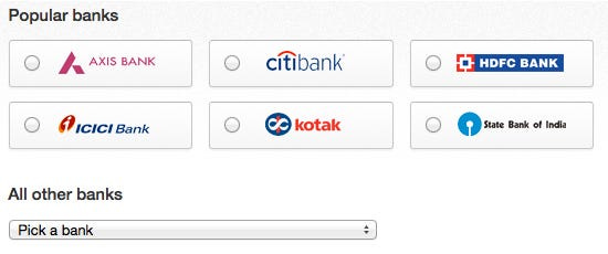
For people who like paying with net-banking, we’ve pulled out the six most popular banks banks to enable single click selection of your bank.
You need confirmation
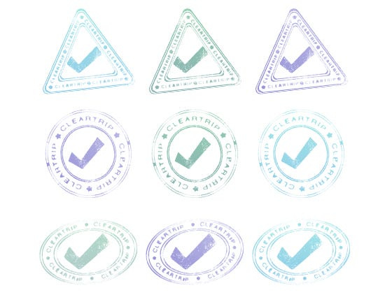
The redesign of the confirmation page uses a boarding pass metaphor to display your booking details. To make the metaphor complete, we designed a bunch of rubber stamps, with which we “stamp” each booking.
We designed a total of nine stamps — three different shapes in three colours each. One of these stamps is randomly selected and displayed for every successful booking you make.
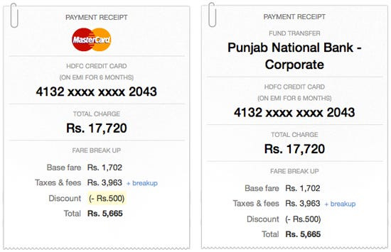
Payment receipt
Another nice touch is the new payment receipt on the confirmation page. The old design of our confirmation page pushed the payment details into the right column and gave them very low visual priority. The new design gives pride of place to the payment details in a gorgeous little receipt.
That sums up a lot of the little details that went into this redesign. We’ve always been huge believers in looking after the details, because all the little things add up to a big difference.
Originally published at blog.cleartrip.com on August 1, 2012.


