

38% jump in booking steps for Live entertainment at BookMyShow
Design nuances that brought significant impact on conversion. We made these changes in 5 weeks and saw a 38% jump in people moving into the funnel.
We at BookMyShow are always trying to improve your overall experience of booking and discovering things to do in your city. With recent changes in homepage and after introducing movie mode, we thought of improving booking steps while you book your events, plays and sports.
This post shares some design nuances and how did pure design enhancements bring significant impact on conversion. We made these changes 5 weeks ago and boy! we saw a 38% jump in people moving into the funnel.
First, the challenge. Live entertainment is a complex product with so many variations and steps even after you decide to go to an event. People end up having choice paralysis if we don’t handhold them at various touch points.
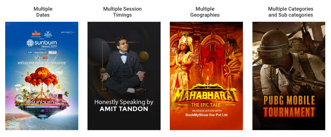
Selection touch points
Not necessary in the following order
Seated versus Non-seated (First come first or free seating)
Category and (sometimes) subcategory with different price points
Venue — In case of multiple venues and (sometimes) geographies
Session time — When there are multiple show times of the same event
Venue & Session — When the same event is happening at multiple venues at different times
Actual selection of seats — A1 or K6
Number of people attending
Following are few examples of such events
Before the fix
It has been a huge learning curve for us to understand the very dynamic nature of events, plays, activities, and sports. We were building flows on-the-fly to cater all sorts of events. With the rapid increase in supply, we landed up in the following state.

Problems with the above flow
A flat approach for all events thereby creating consistency but; Context rules over consistency.
The flow doesn’t create any perception of steps which is necessary since the user is committing to certain steps as he or she moves ahead in the journey.
No acknowledgment of what the user has selected in the previous steps. This leads to too many back and forth between these steps.
Lastly, it doesn’t convey how many more steps to go. This leads to anxiety and frustration. With a limited attention span these days, this solution was not adequate.
Improvements
We identified all the possible combinations and states in which the progression can happen. This is where we introduced stepper flow. The stepper component handles up to a maximum of 4 steps on a standard 350px width device. For our advantage at BookMyShow, the majority of the events are 2 step process, while a few big events have 3 steps. 4 step process is an outlier and can happen a couple of times a year — super edge case.

Practical application
This was made live in the last week of July 2019 on all platforms; Mobile web, and app. The desktop is coming soon. We are so thrilled and proud to share that there has been a huge jump of 38% in people moving from the Show Details page to Order Summary page. Here is how it looks in reality


Learnings and takeaways
Progress isn’t just functional
A simple visual stepper can relieve anxiety, set expectations, and make users feel in control, especially in multi-step flows.Consistency shouldn’t override context
Uniform patterns are useful, but blindly applying them across complex scenarios can create more confusion than comfort. Design must respond to real-world variations.Memory is a design responsibility
Don’t make users remember what they selected. Showing past choices builds confidence and reduces friction, especially in branched or layered flows.Scalability comes from pattern thinking, not patches
Taking time to map all possible states and flows upfront creates systems that are robust, not reactive there by saving effort and avoiding UX debt later.Small design tweaks can drive big business impact
This 38% uplift came without building new features but by just redesigning the experience. Designers should track metrics, test hypotheses, and show how craft drives growth.