

Pots. Savings reimagined for growth
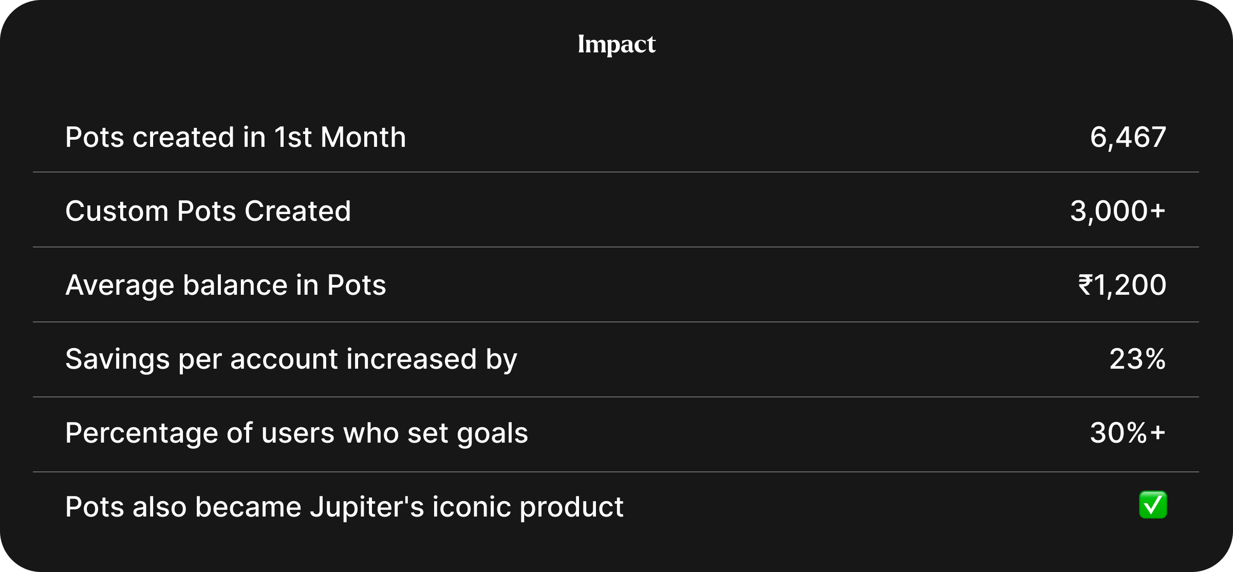
How Jupiter's VP of Design turned a rigid banking product into a goal-based savings experience — 6,467 Pots in month one, 23% more savings per account.
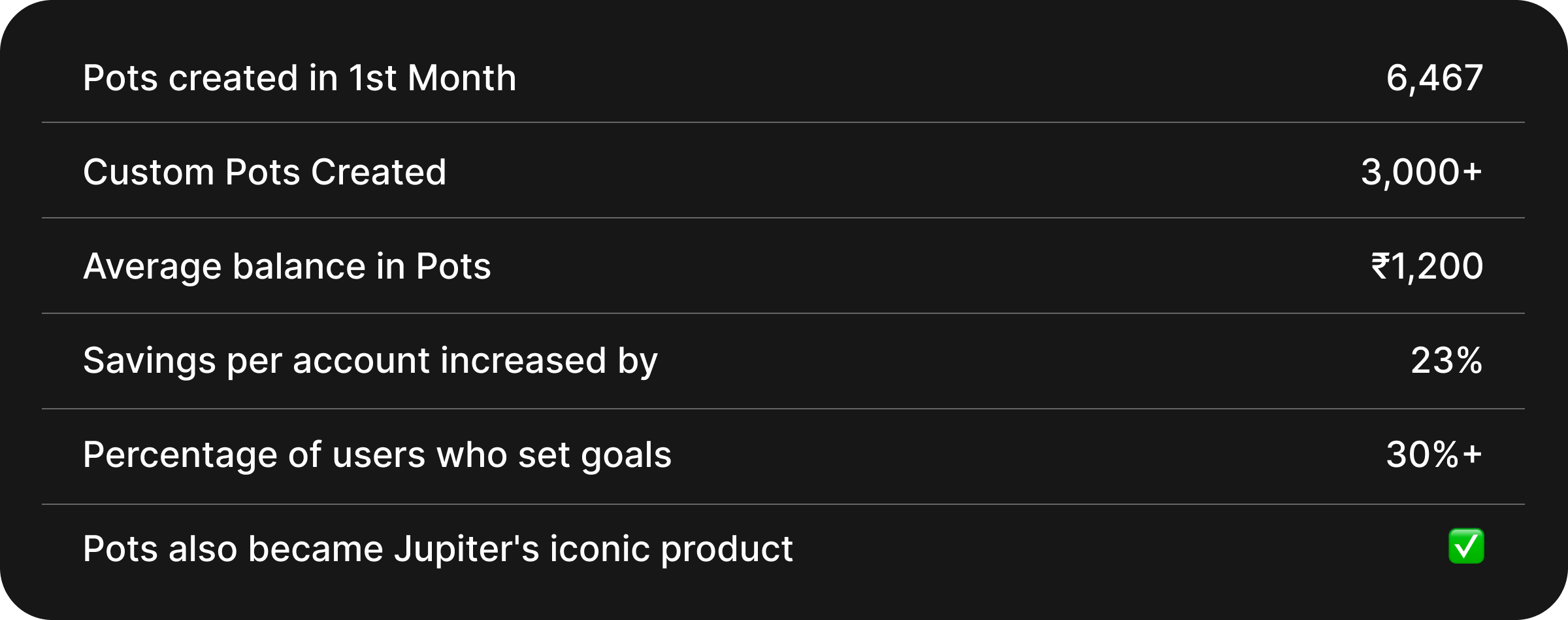
6,467 Pots. One Month. Four People. Six Weeks.
We built a savings feature that changed how a generation relates to their own money.

First the numbers → then the story.
Jupiter Money, India’s first fully digital bank for millennials and Gen Z, needed a savings product that matched how young Indians actually thought about money. I led design as VP, with a team of four, from research to launch in six weeks.
This is how we got there.
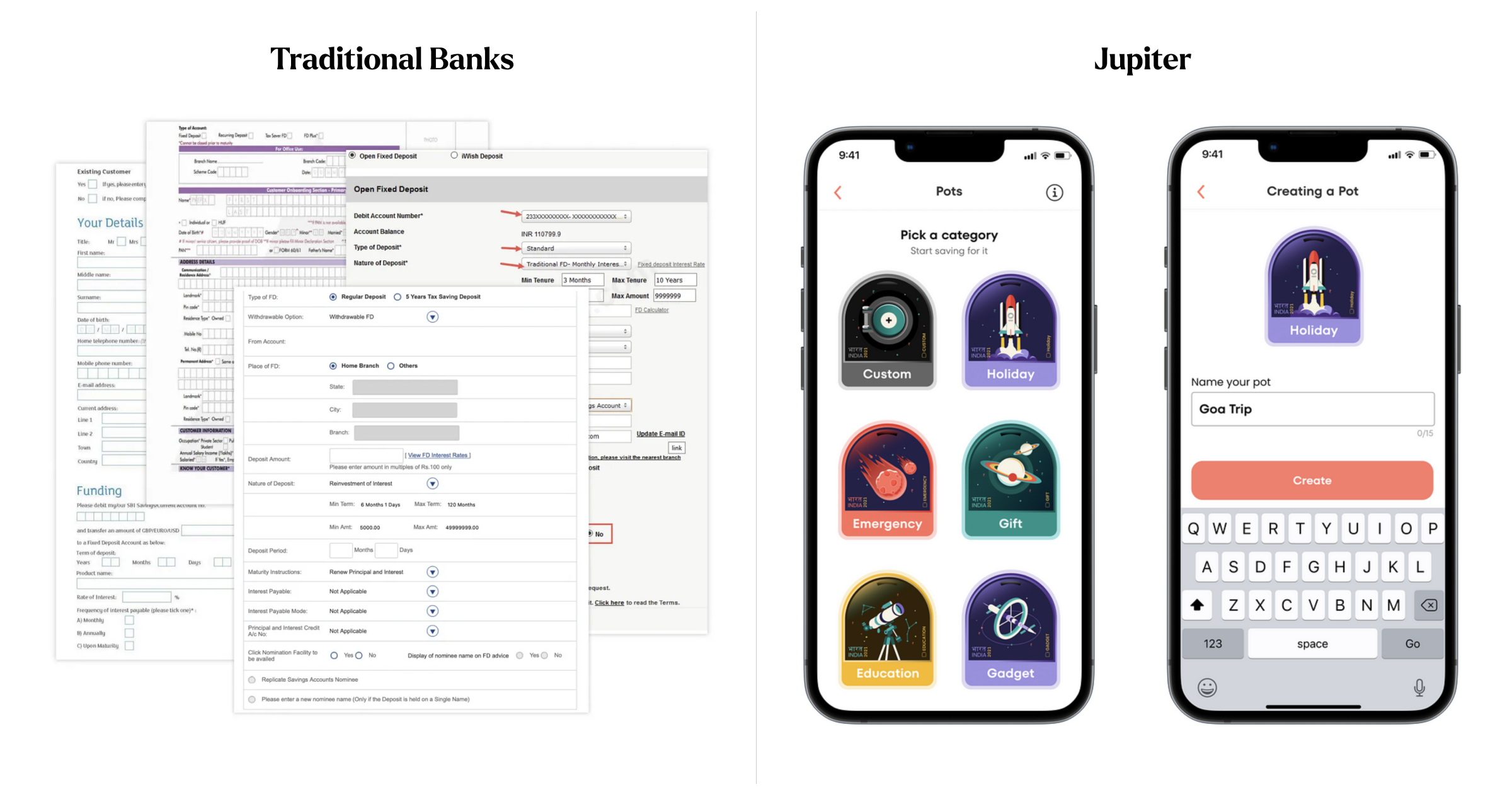
The traditional model is passé. Everyone knew it. Nobody fixed it.
Traditional Fixed Deposits dominated Indian savings for decades — designed for a generation that saved out of fear, not intent. For our users, that model had collapsed.
82% found Fixed Deposits too rigid for modern life
52% forgot which money was meant for which goal
41% accidentally spent goal money on something else
89% never felt savings as progress
The mental model for goal-based saving already existed inside people's heads. Nobody had built the digital version of it.
The shift: From fear to intent
Our parents saved because tomorrow was uncertain. Our users save because they know exactly what tomorrow looks like.
This single insight changed the product architecture, the visual language, the interaction model. Savings for this generation was and ambition and the product needed to reflect that.
One week of research.
A tightly scoped one-week sprint across three parallel tracks:
12 qualitative interviews — millennials and Gen Z, ages 22–38
800-person survey through our Telegram early adopter community
1,200-person quantitative study across 8 cities
Tightly scoped research beats volume anyday.
What we found:
76% of users saved with a specific goal in mind.
82% found fixed deposits too rigid.
52% forgot which money was earmarked for which goal.
41% accidentally spent goal money on something else.
89% never felt savings as ‘progress’
Users wanted to visually track progress toward their goals in real time.
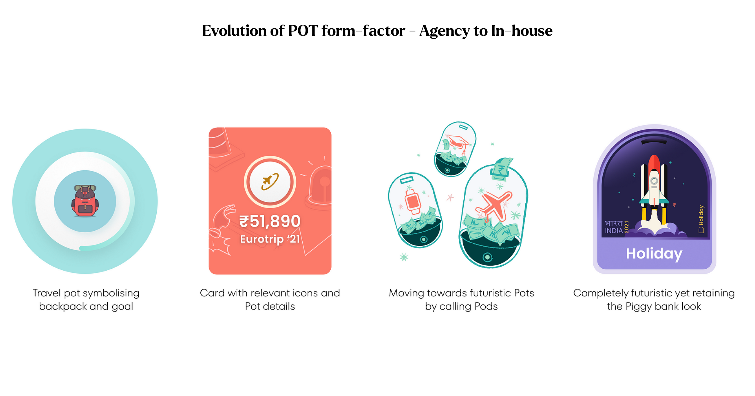
The hardest design decision was political.
Every Pot required a unique sub-account number at the Federal Bank level. That was regulatory reality. The easy path was to expose some of that complexity to the user, ship faster, move on.
We were asking users to change their relationship with saving. We had to earn that trust completely.
This meant sustained negotiation across product, engineering, legal, marketing, and our banking partner. Months of constraint navigation before a single pixel was finalised. The design team advocated, negotiated, and protected the user experience in every room we sat in.
What we stripped away:
Maturity instructions
Interest payment modes
Lock-in periods
Every form field the bank already had the answer to
What we replaced it with:
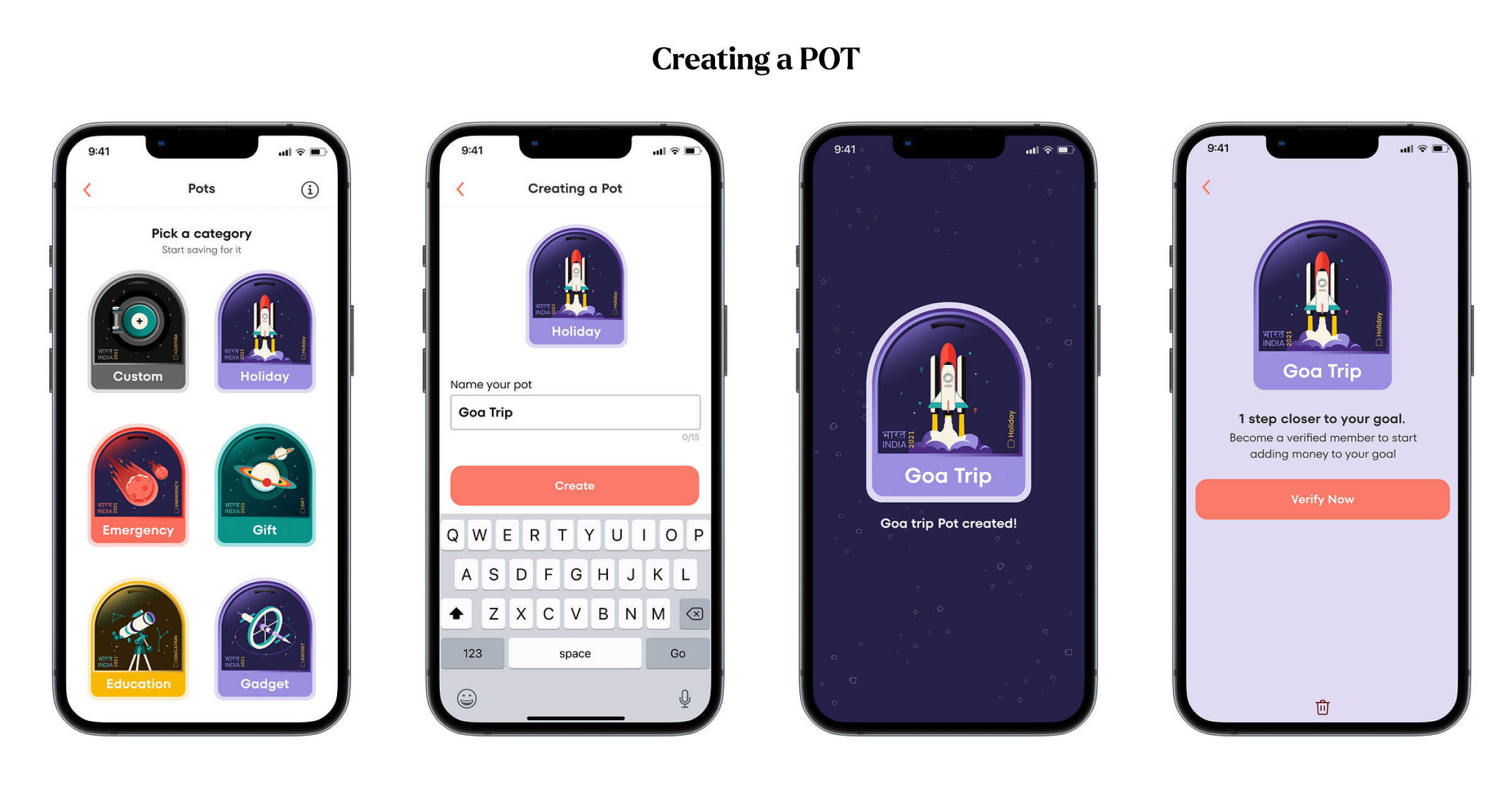
Select a category → Name it → Done. Under 30 seconds.
Design is in the details.
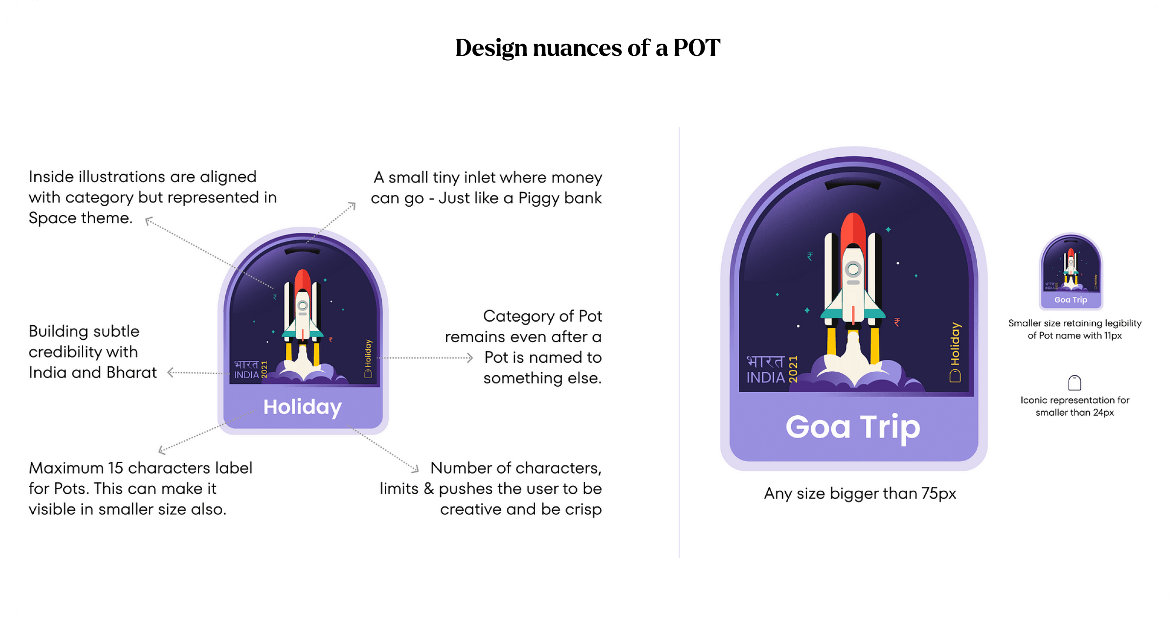
The name limit wasn’t a technical constraint. It was a design decision. It forced intent and made the user think. (A little friction before committing to save)
Goa Trip. New Mac. Mango’s Vet (my dog’s name is Mango).
That specificity, forced character limit was what made saving feel personal. It transformed an abstract financial act into something that belonged to the user’s actual life.
Every craft decision was deliberate:
Coin slot at the top — familiar nod to the piggy bank without being childish
Space-themed illustrations — modern, aspirational, distinctly Jupiter
India and Bharat marking — cultural credibility, embedded quietly
Scales from 75px hero to 24px notification icon — built to live everywhere: in-app, campaigns, social
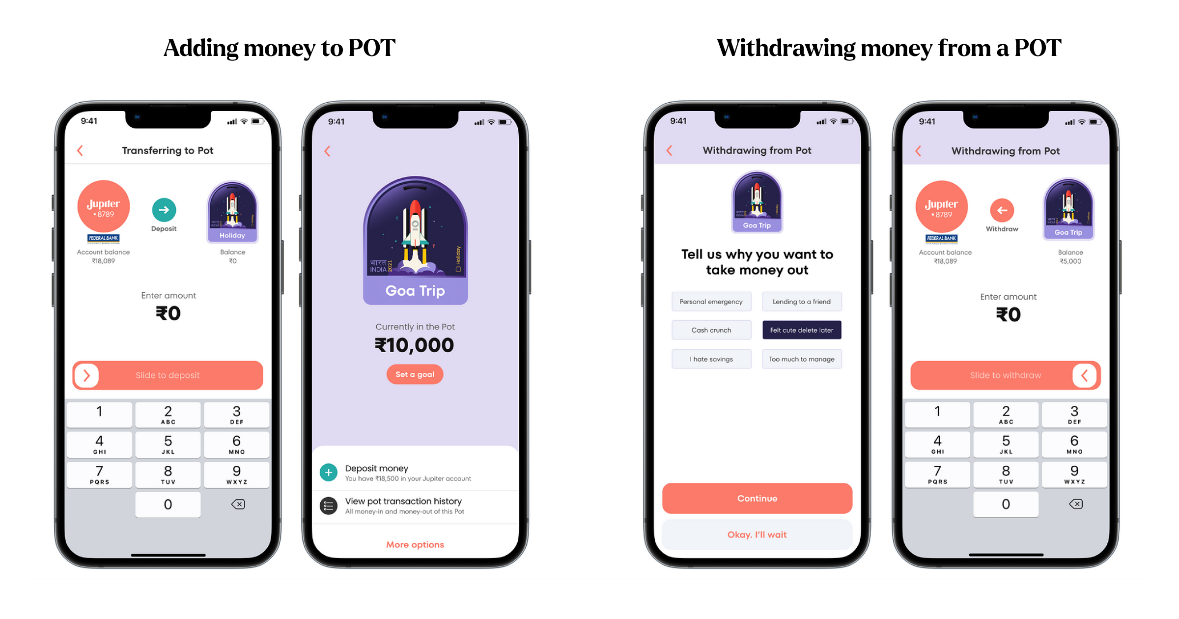
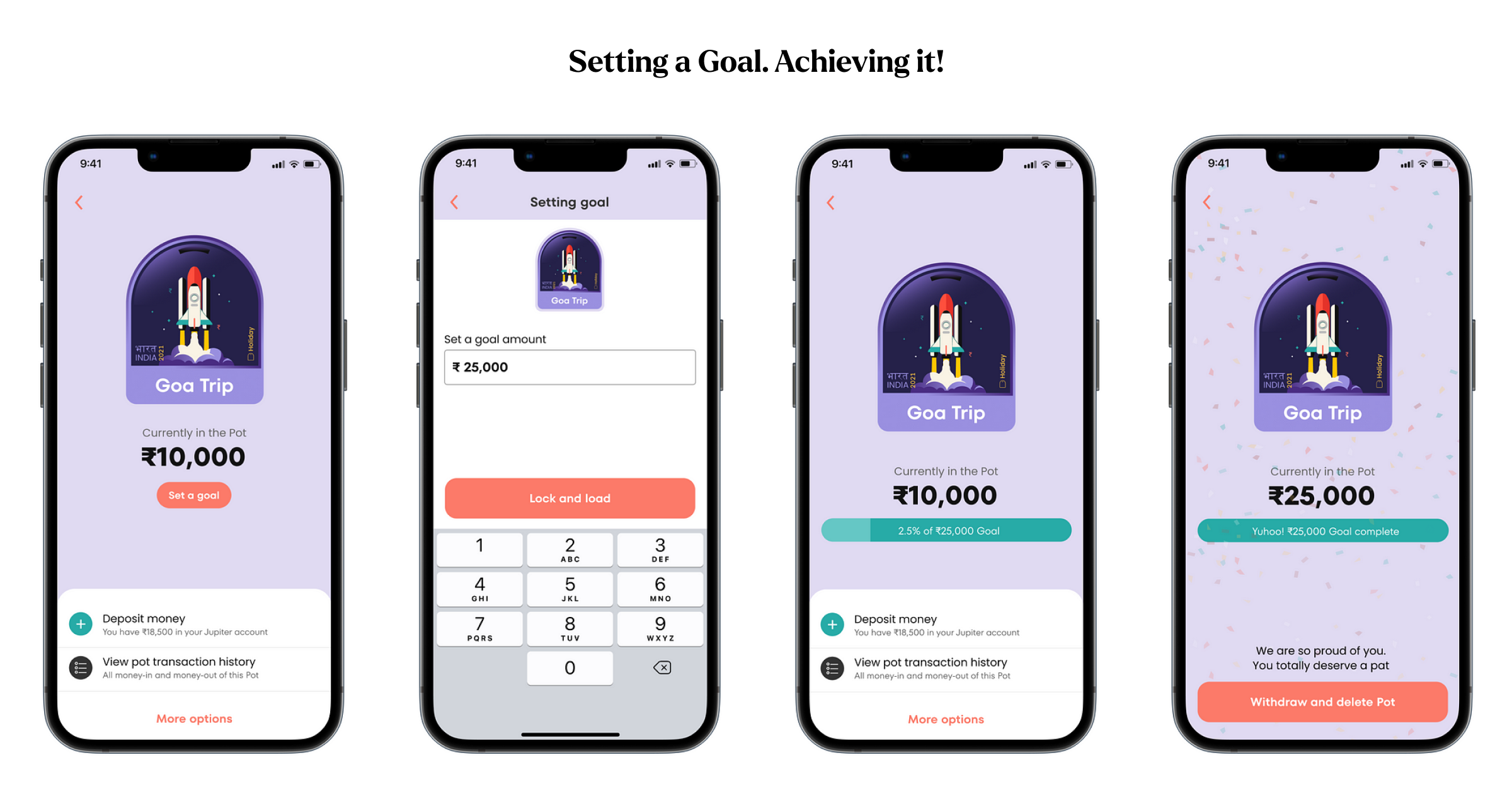
When users asked to lock their own money, we knew, we were on right track.
Users requested a Goal feature, which locks the Pot — something directly opposite to what they said they wanted in research. They wanted to build habits. They wanted to brag. Design had earned their commitment.
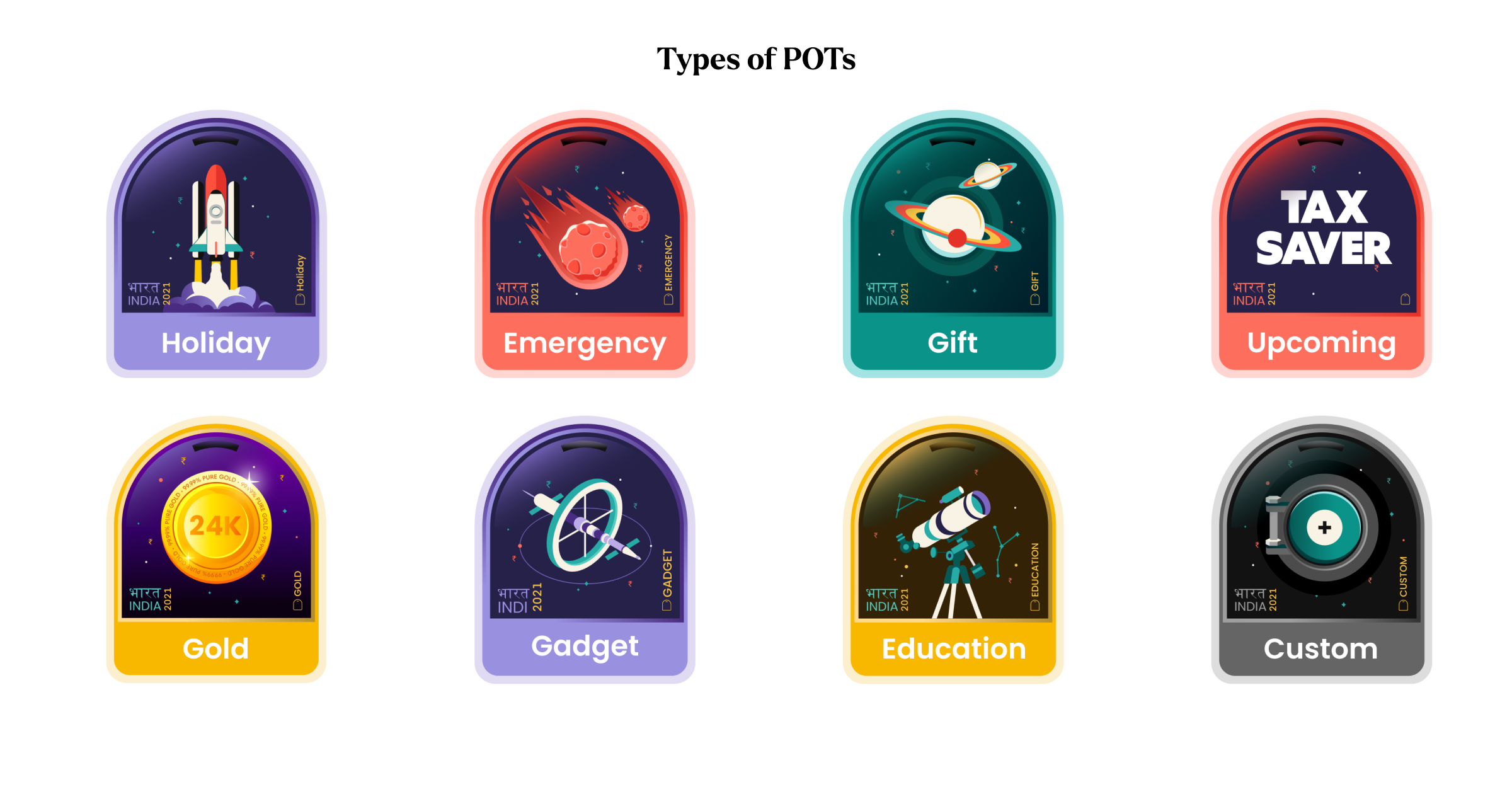
Custom Pots told the real story. Users saved for goals we hadn’t imagined — a dog, a friend’s birthday, paying back a loan early. The categories we designed to became a starting point.
A product that becomes a brand story is worth more than a product that simply works.
Pots became Jupiter’s most recognisable feature — and its most powerful marketing asset. It was the thing people described when they told a friend about Jupiter. Not the account opening. Not the debit card. Pots.
What this taught me about design at scale
Hide the complexity. Always. The user should never feel the weight of the system behind them.
The room matters as much as the screen. The most meaningful design happened in negotiations with engineering, legal, and finance and not in Figma.
Prototypes close alignment gaps faster than presentations. Show and tell.
Craft is how you work with people, not just what you ship. Shared belief is a design deliverable.
A product that becomes a brand story is worth far more than one that simply works.
The summary: Design as a business function
One regulatory constraint could have killed an idea.
This is what design looks like when it operates as a strategic, cross-functional, outcome-driven function — not just as an aesthetic layer applied at the end.
If your product has a problem that users have stopped complaining about because they’ve stopped trying — that’s the problem worth solving.
Kedar Nimkar is a design leader with 20 years of experience building digital products across fintech, travel, entertainment, and proptech. Host of The Gyaan Project — India’s longest-running design podcast.