Redesigning booking steps
A few months ago, we announced a better, slicker, faster Cleartrip Account. Cleartrip Account was the first of our products to get a gorgeous new design and an improved front-end architecture. At the time, we promised to roll out the new design language across other parts of the site:
It has laid the foundation for a raft of amazing super-secret features which we’re already hard at work on.
The 4 step booking process on Cleartrip has seen many incremental changes since we launched, but over the last five years, it’s never been wholly re-imagined and redesigned. Last week, with great excitement, but little fanfare, we rolled out a completely redesigned booking process for flights and hotels.
Ring out the old, ring in the new
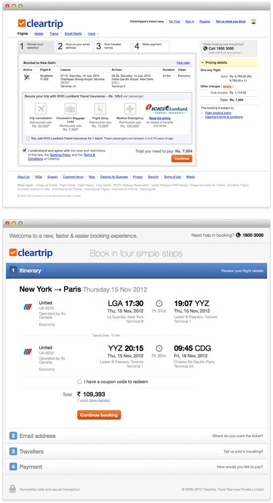
This image shows a quick comparison of our old and new booking screens.
Lots has changed, here’s the big ones:
Orientation — The old booking steps were horizontal with a top-level progress indicator. We’ve changed this to a vertical accordion-style format, which lets you move through the different steps to complete your booking.
Compact view has been introduced to display a summary of the relevant information for each each step you complete in the booking process. The compact view is dramatically more efficient than the right-column summary we were displaying previously.
Cleaner forms with in-place error handling and better notifications for server side accidents.
Under the hood lies a lot of highly optimised code and asynchronous server calls to make the booking process look and feel smooth and quick.
The delight is in the details
Yep, delight. Most travel companies don’t really focus on delighting their users, we’re not one of them. We’ve added tons of little touches, which, hopefully, make your travel booking “feel” happier. We all love to travel, so why shouldn’t booking travel make us equally happy?
Itinerary step
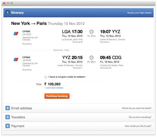
When we redesigned the Cleartrip Account, we introduced a uniform itinerary format, which was consistent on our desktop and mobile products. With the redesigned booking process, that uniform itinerary is now available when even you’re making a booking. For the first time, we’re introducing a compact itinerary view which is persistently visible throughout the entire booking process. The compact view contains essential information required for your review as you proceed with your booking.
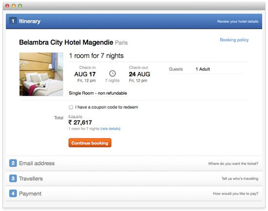
Here’s what the hotel itinerary looks like
Sign in step
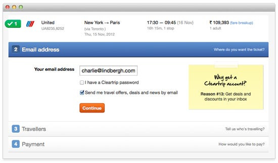
We thought we’d have some fun letting new users know just why they should get their very own Cleartrip Account, so there’s a raft of reasons displayed in a little yellow sticky note to the right of the sign in form. If you already have a Cleartrip Account, the message on the note changes. We’re not going to say what it changes to, see for yourself the next time you book.
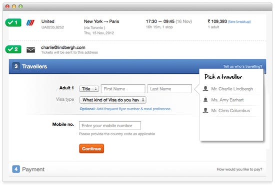
Traveller info step
When we relaunched the Cleartrip Account, we added faster booking for friends and family by allowing you to store traveller names and extended profiles in your Cleartrip Account. That list of names is now available in the newly designed booking process. Adding traveller names while you’re booking has never been simpler or faster. If you’ve stored multiple traveller names and profiles in your Cleartrip Account, a list of their names becomes visible whenever you click in a traveller name field. You can click the name you want or just start typing to narrow down the list. All the available and relevant information for each traveller stored in your Cleartrip Account will be processed with the booking, including seat and meal preferences, passport information and frequent-flier memberships.
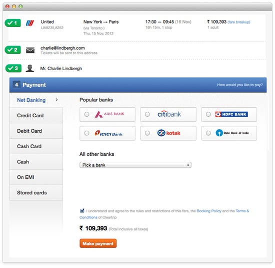
Payment options
Popular banks for net banking are pulled out from the list so you don’t waste time in searching your bank. None of the payment forms request contact information we already have again, significantly reducing the number of fields you need to fill out before you can book.
Expressway
One-touch flight bookings with Expressway just got a hell of a lot sexier — just one field to be filled out and one button to be clicked.
There’s so much more to the new design, but we just couldn’t fit it all into one post. We’ll be sharing more about our beautiful new booking confirmation pages soon, stay tuned.
Originally published at blog.cleartrip.com on July 24, 2012.


