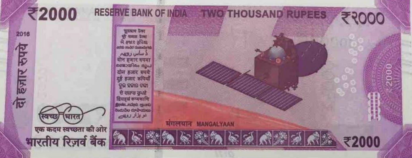
Why the 2000 rupee note is the way it is.
The designers who created the new Rs.2000 note live in a practical world. It’s naive for me to do a design critique without knowing all sides of the elephant. Still, this is an attempt to address a few things.
Short answer
The design could have been better (aesthetically). But looking at the larger context, discussing layout, typography, alignment, color, and graphics seems very shallow.
Long answer
If Narendra Modi or any of the RBI people wanted to get it designed something, why wouldn’t they approach David Carson, Stefan Sagmeister, Paula Scher or any of the IIT and IDC Ph.Ds for that matter? The designers could have copied some of the stuff from Travis Purrington just like we get influenced by Dribbble.
But that's not the case. Even if the best design folks were given an opportunity, they would have come up with something marginally better. I am not defending the new design, but I am making aware of the constraints within which it would have been designed.
“Always design a thing by considering it in its next larger context — a chair in a room, a room in a house, a house in a environment, an environment in a city plan.” — Eero Saarinen
Every designer has to design under constraints and that is the beauty of it. Following are just a few of the thousand things that I found while doing my research and trying to understand the thought process behind the new 2000 banknote.
Language
The new note should have Rs.2000 written in 17 languages out of 22 official languages.Latent Image
This image should be visible only when the note is held at an angle. This is one of many security measures.Guarantee Clause
The governor’s signature with the Promise Clause and RBI emblem is nondebatable. It has to be there.For visually impaired
It will be printed in intaglio i.e. in raised prints, which can be felt by touch. RBI Governor’s signature, the portrait of Mahatma Gandhi, the Reserve Bank seal, the guarantee and promise clause, Ashoka Pillar Emblem all should be in intaglioSecurity thread
Windowed security thread with inscriptions ‘भारत’, RBI, and 2000 on banknotes with color shift should be done for security reasons. Color of the thread should change colors when the note is tilted.Fluorescence
Since all financial institutions have to check the authenticity of notes, let’s have a special spot that can not be replicated easily. The number panels of the notes should only be visible when the notes are exposed to an ultra-violet lampIdentification mark
A special intaglio feature has to be in different shapes for various denominations (Rs.20-Vertical Rectangle, Rs.50-Square, Rs.100-Triangle, Rs.500-Circle, Rs.1000-Diamond) and that will help the visually impaired to identify the denomination.And many other small must-haves
1. Year of printing of the note on the left
2. Micro letters ‘RBI’ and ‘2000’
3. See through Register
4. Father of the nation — illustration
5. Handling of soiled and mutilated notes
6. Legal provisions against counterfeiting
Banknote designers are specialized in both art and manufacturing. Just FYI (Currency paper is composed of cotton and cotton rag). The design of money begins with ideas and rough sketches. Then, like piecing together a puzzle, banknote designers must incorporate design elements around selected security features, while maintaining the “look and feel”. Designers strive to retain familiar elements and convey an image that is uniquely Indian and reflects the strength of our economy.
Banknote designers use both cutting-edge, digital technology and classic tools like pencil to develop banknote concepts. They must not only consider the imagery of a note, but also its reproducibility during manufacturing — considering how details such as outlines, tone, and shading will “translate” when engraved and printed on an intaglio press because each stage of the manufacturing process has its technical requirements. A design concept typically includes dozens of iterations and extensive testing over several years before a final design concept is presented to the Secretary of the Treasury for approval.
Process of making a currency
Raw Materials
Design
Manufacturing
Engraving the master die
Making the master printing plate
Printing the front and back of the bills
Printing the colored treasury seal and serial numbers
Cutting and wrapping the notes
Quality Control
Distribution
Fraud handling and a thousand things.
Surely this opened my eyes to the real world. If I had more knowledge and had dedicated my career to the government, I would have totally given my best to design the best possible currency note. Unfortunately, so far I am just learning interface & experience design.
For further reading on currency & its process:
This is in response to all the design critiques of the new Rs. 2,000 happening over the internet.


